Magic Menu Maker aims to provide restaurant owners with a platform to build and edit their menus in real time. Menus can be customised, uploaded to their own websites and/or published to delivery apps.
Orders can be taken through the app straight to the business and sales data can be collected and assessed to help give insight as the business grows.
Magic Menu Maker
Menu Creation App Design
Project Overview:
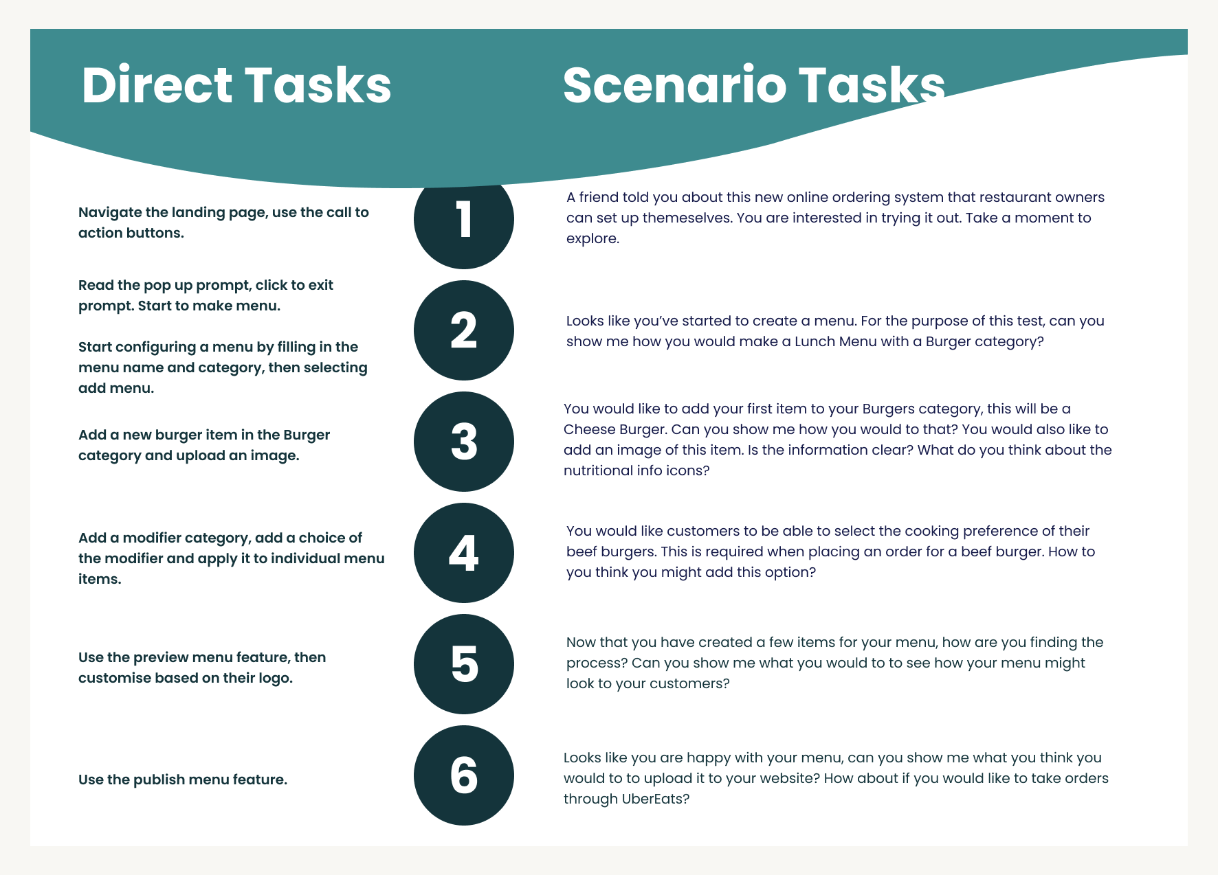
10 week work placement, the intended outcomes were to produce a hi-fi Prototype that could be soft launched. First round of testing had already been completed with a low-fi Prototype, from these insights a re-design was ordered with another round of testing to be completed.
Details:
Role: UI/UX Designer
Team: Developer, Product Owner
Location: Remote
Duration: 10 weeks, October-December 2022
Software: Figma, Miro, Zeplin, Slack
Updated Menu Item Card
Updated Modifier Card
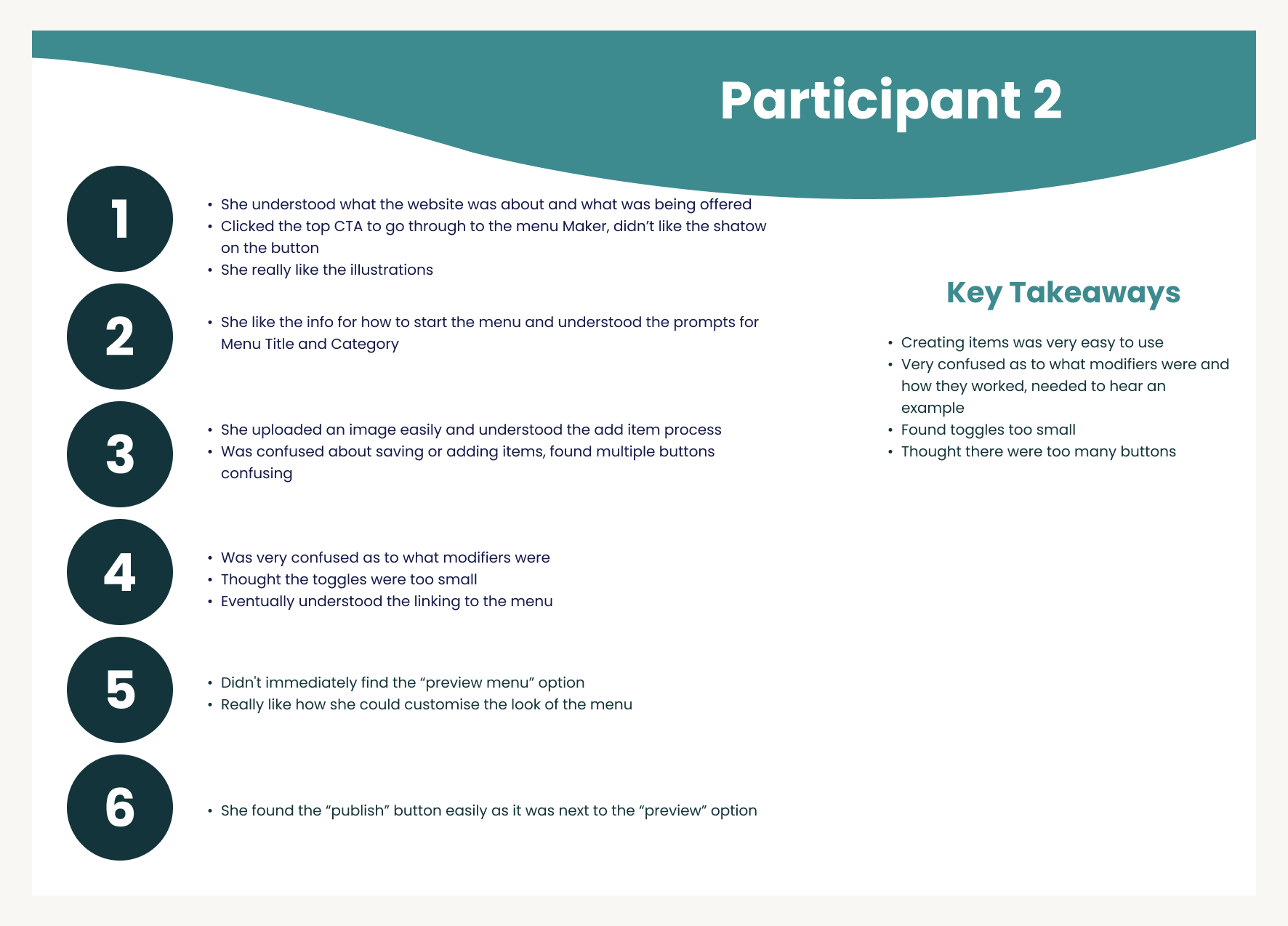
The original design was tested and it was found that users were struggling with linking the “modifiers” to the Menu Items. They were also overall confused with the idea of “modifiers”. After trouble shooting ideas and a possible name change with the Product Owner it was decided to keep the term “modifiers” but add more information and explanations through pop ups and tool tips to help guide the user.
Note: Modifiers are changes that a customer can make to a menu item and can be a requirement to progress with an order or an option- for example adding or removing ingredients to a burger, this would be optional and would have unlimited selections. Meaning this would not need to be specified for an order to progress. Cooking preference however would need to be specified and only one option could be selected. This made the Modifier Card particularly difficult as it needed to cover so many variations.
These are the updated cards to add a Menu Item. The layout was changed to be inline with how the final product card would be displayed, this was to aid the user in understanding what information they were adding and where it would appear on the final item.
The Modifier card was also updated to try to make the process more clear. Instead of dragging the card to the Menu Item to link it a toggle was added to allow the user to link modifiers to entire menus, entire categories within a menu, or individual items.


Challenges identified by user testing
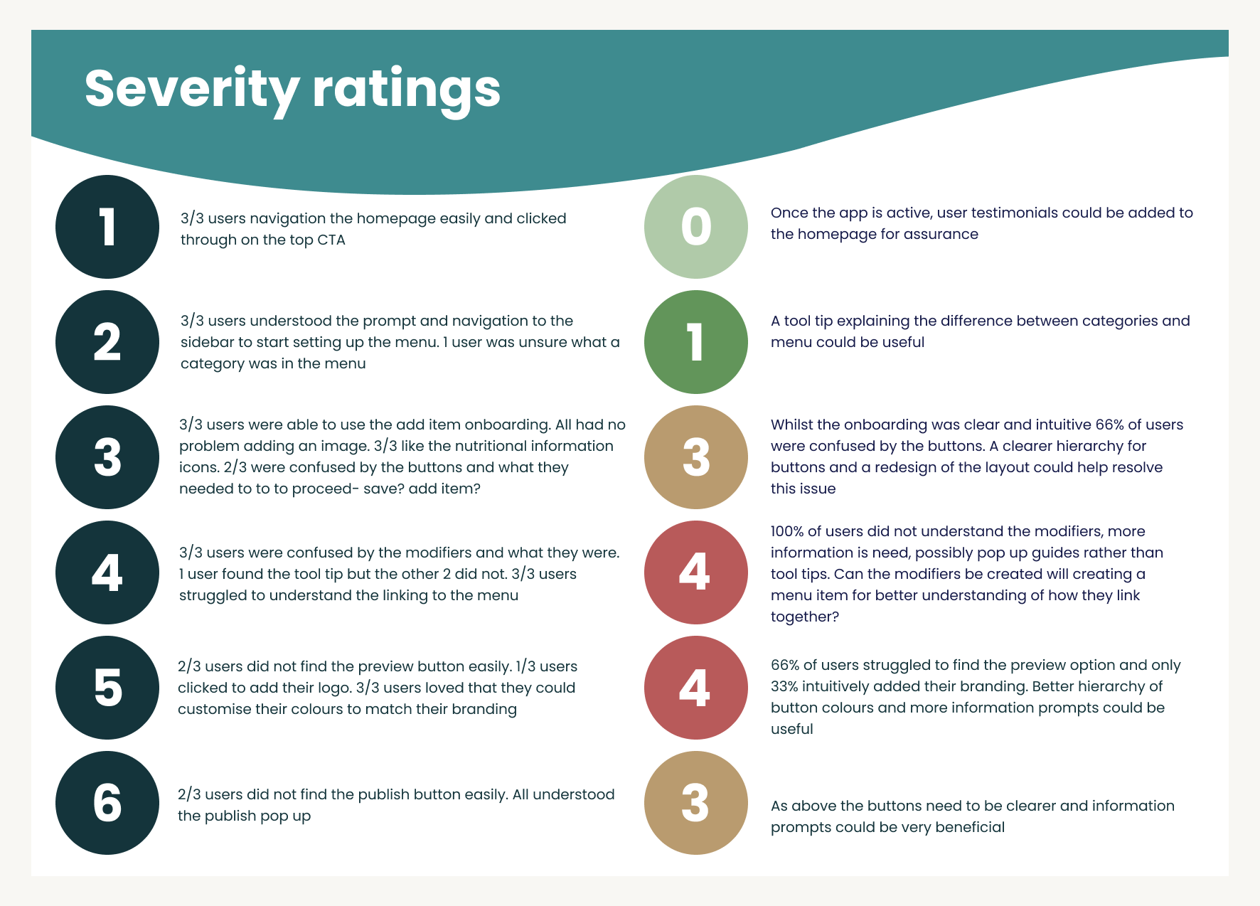
Buttons were very confusing, too many options, not sure which was the priority
Onboarding of Menu items was intuitive but users were unsure how many fields they would need to fill in or how long the process would take
Modifiers are still too confusing, tool tips were useful but only when the user found them
Users struggled to find the “Preview” button
Solutions
Redesign of colour scheme to present a clearer hierarchy of importance
Redesign Menu Item Cards to show how far along in the process the user is
Combine Modifiers with Menu Item Cards to help better explain their purpose, replace tool tips with pop ups to help guide the user through the onboarding process
More pop ups to help highlight features on the main dashboard
New Menu Item Card
Combines the Menu Item with the Modifiers to hopefully better explain how the two work together.
Status bar has been added at the top to show the user their progress.
Animations and pop-ups help highlight helpful tips and give further explanation to terminology.
Overall the card is larger to give the user more space and to not make all the text overwhelming.


