As a keen surfer I spend my life checking surf reports and swell maps to know the conditions of my favourite spots.
There are no shortage of sites that offer all sorts of information from swell height and direction to water quality and temperature, many even give an overall star rating.
But what most of them lack is tidal information, sure they all tell you when high and low tide is, and almost all give you the height of the tide at those given times.
But what about the time in between? This is hard information to come by and even harder to find for a previous day.
Tide.is
Tidal App Design
Project Overview:
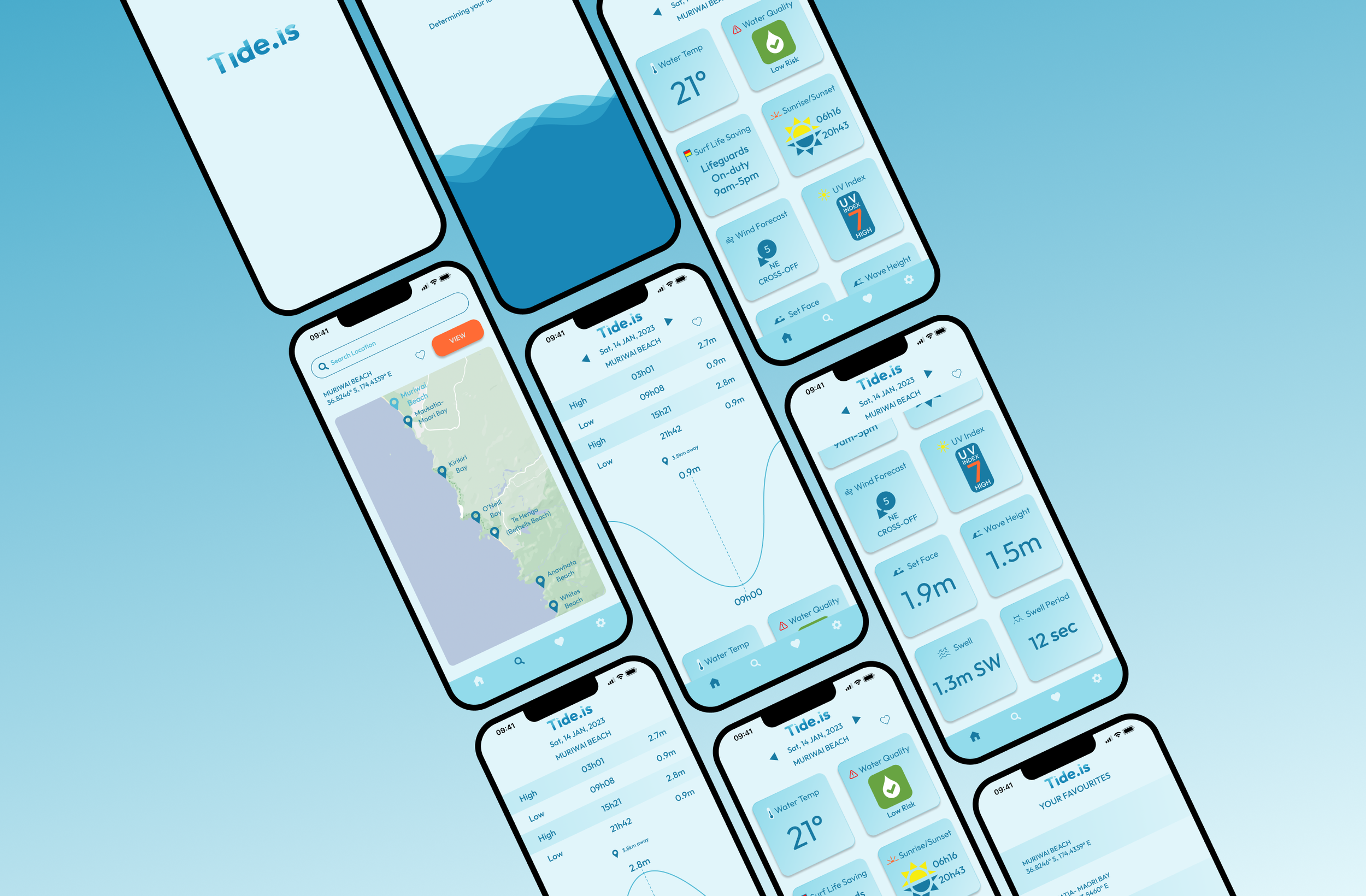
Design a mobile app that displays the time and depth of high and low tide at the users geographical location.
Details:
Role: UI/UX Designer
Location: Remote
Duration: 4 weeks, January 2023
Software: Figma
Challenges
• Keeping the user engaged while geographical location is being loaded
• Provide intuitive interactions so lots of information can be accessed on a small screen
• Mobile first design so information can be easily accessed on the go
• Information needs to be clear and concise
Solution
Clearly display important tidal information, interactions to be intuitive, allowing the user to find further information easily without having to search or navigate to other screens. Minimal, clean design so as not to pull focus from the information provided.
Initial sketches and ideas. Designing mobile first and bearing in mind the comfortable movement of a single hand. I knew I wanted to have a drag interaction to show the height of the tide at different times of the day.
Option 1:
This had the user drag a toggle up and down the rise and fall of the tide over time. This was difficult as the space for the tide chart was small so a drag interaction would have to be very sensitive and could be difficult to use.
Option 2:
This idea was to have a fixed point for the reading and then drag the tide chart behind, this design worked better as the area for drag could be much larger and therefor easier for the user to interact with.
Typography
Outfit, a geometric sans serif font was selected as it remains clear and legible at a small size. The uniform shape feels familiar to font used for signage and instructions. As the app is giving factual information it was important to pick a font that wasn’t too playful or stylised.
Colour Palette
Monochromatic Blues were a natural choice for an app about the tide. Orange as Blues complimentary was chosen as the colour for all primary actions. Red and Yellow associated with surf life saving and safety were chosen as minimal accents.
Engagement
One of the biggest challenges was keeping the user engaged while the app searched for their geographic location. For this I designed a small animation for the loading state. This ensured users knew that something was loading rather than waiting on a frozen screen.


